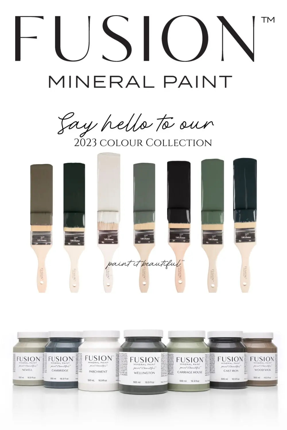
Introducing the Latest Colour Release from Fusion Mineral Paint
Fusion Mineral Paint is known for its high-quality, easy-to-use paints that are perfect for all types of DIY projects. From furniture refinishing to home décor, their paint is our only go-to choice for DIY projects. The brand recently announced a new colour release for 2023 and it's worth taking a closer look at not only what they have to offer, but a more detailed understanding of the colours themselves and how they compare to Fusion's current line up.
We love this new mix of traditional and grounding colours - they are perfect for a host of different design styles and applications. From the soft and calming tones of the lightest neutral shades to the bold and confident presence of the deepest green and newest off-black, these tones offer a world of creative potential.
Let's start with Newell, the newest sage green. Deeper and more grounded than Fusions Eucalyptus and Bellwood, this mid-toned green is perfectly balanced between green and grey.
When compared with Everett on the left, Newell is a mid-toned sage green. However, compared to the strong grey tones of Little Lamb on the right, you can see the strength of Newell's grey undertones.

Moving on to the other newest neutral, Parchment, Fusion has stayed with their grey green inspiration. Parchment is a modern white with grey and green undertones. It may be difficult to see in the pic below, but when compared with the stable neutral white of Victorian Lace on the right and the creamy warmth of Raw Silk on the left, that grey green undertone really shows itself.

One thing we know about Fusion - no one does classic blue shades better and we are not disappointed with Cambridge! A deep and elegantly weathered blue, it has a lot of grey in it but still leads with blue.
When compared to Midnight Blue, Fusion's deepest and blackest blue, Cambridge is more subdued. However, when compared to Chestler on the right, you can really see those grey undertones take the lead.

From Cambridge to Wellington... Fusion is once again leaning into green tones with this bold shade. Perfectly balanced with green, black and subtle bronze undertones, Wellington is a sophisticated, confident shade. We can't wait to try this one!
Comparable in depth to Ash on the left, Wellington really leads with that dramatic green tone. However, next to Coal Black, it shows up as a true charcoal.

Staying with the bold, Fusion has also given us another Off Black to add to our collection of favourites. Cast Iron is a true off-black, but with strong warm undertones. When compared to Ash on the left, Cast Iron (like Wellington) is comparable in depth but has a really warm richness. When compared to Coal Black on the right, however, it stands out as a true off-black.

We love the feel and inspiration behind Wood Wick. Inspired by candle-lit evenings, it's a cozy mid-toned brown. This shade pulls its tone from opposite ends and meets confidently in the middle.
When compared to the deep brown of chocolate on the left, you can see just how much grey there is in this shade. When compared to Algonquin on the right, we see just how deep and warm the brown tones are.

And last but certainly not least, Fusion has done classic with a modern twist with Carriage House. While still favouring the grey and greens, there is more energy to the green to give it a charming but grounded look.
When compared to the soft tones of Bellwood on the left, Carriage House looks confident and punchy. However, next to the rich green of Conservatory on the right, it appears more subdued and really showcases its grey undertones.

With so many beautiful shades to choose from, selecting the right colour for your project can be challenging and we're here to help! Stop in to see us in the shop or get in touch by email or phone, we're here to help and love nothing more than helping you navigate Fusion's colour universe.
If you are trying to select colours online, you may also want to consider investing in Fusion's True Colour Cards (now updated with all of the newest shades) or for really prolific DIYer's we recommend Fusion's Paint Sample Decks. The newest shades are already available!